Brand guidelines
How the studio looks, sounds and moves. Quiet, exact, black and white.
What the studio is
Gravitational Radiation is an independent, founder-owned venture studio.
It is a venture lab. It finds real operational problems and builds autonomous systems, with AI at their core, that do the work. It takes no clients and sells no services; it originates, builds and operates its own ventures.
When a venture proves itself, it spins out into its own company.
Vectflow is the first venture: autonomous pipeline infrastructure for independent home service operators in the US.
Vectflow is a trade name of Gravitational Radiation LLC.
Mission and vision
Build and operate autonomous systems that do real work for real businesses.
A permanent, independent studio from which ventures radiate outward — each one built, proven, and released to stand on its own.
The physics behind the name
- Ripples in spacetimeGravitational waves are ripples in spacetime, predicted by Einstein’s general theory of relativity in 1916.
- Emitted by orbiting bodiesThey are emitted when massive bodies accelerate, most powerfully when two bodies orbit each other. The waves carry energy away from the system, so the orbit tightens until the bodies merge.
- Three phasesThe signal of a merger has three phases: inspiral, merger, ringdown.
- First detected in 2015They were first directly detected by LIGO on September 14, 2015 (GW150914), from two merging black holes about 1.3 billion light-years away. The detection earned the 2017 Nobel Prize in Physics.
- Extraordinarily faintDetectors measure changes in length far smaller than a proton.
The metaphor
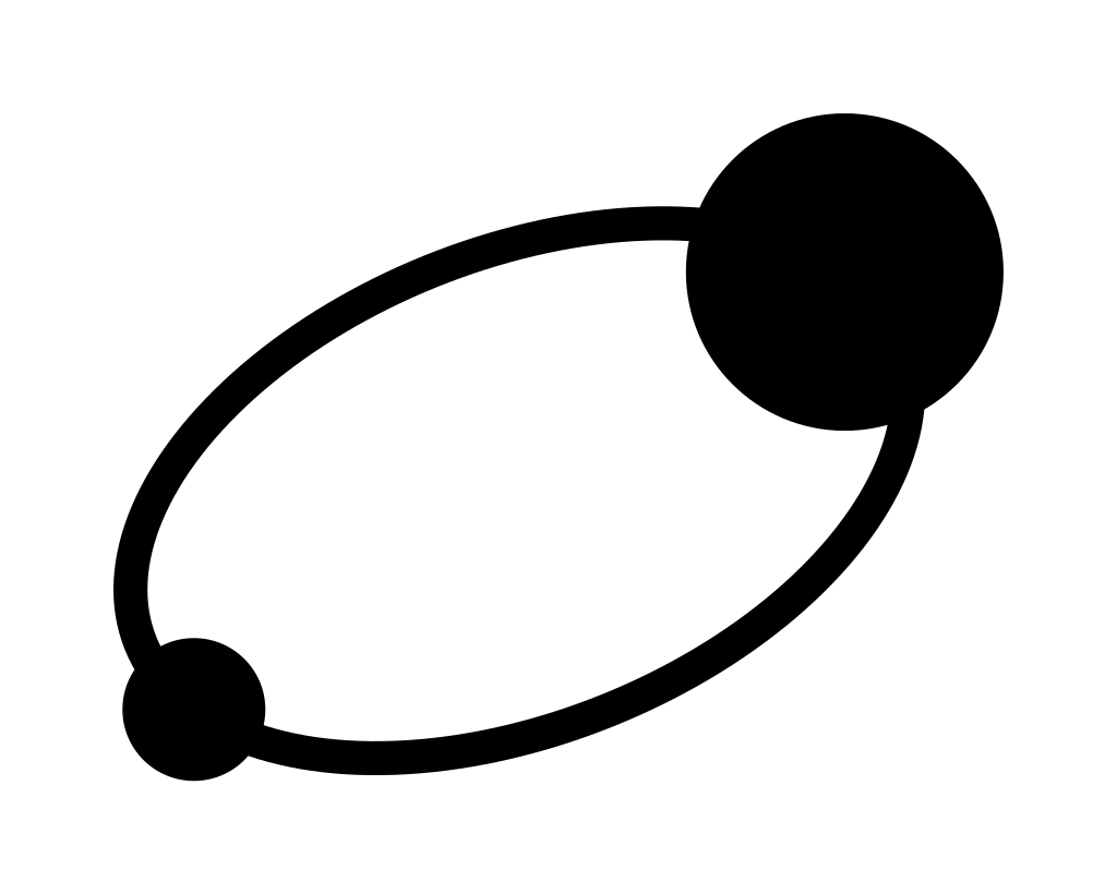
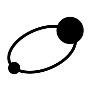
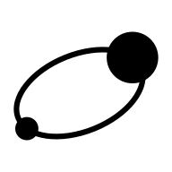
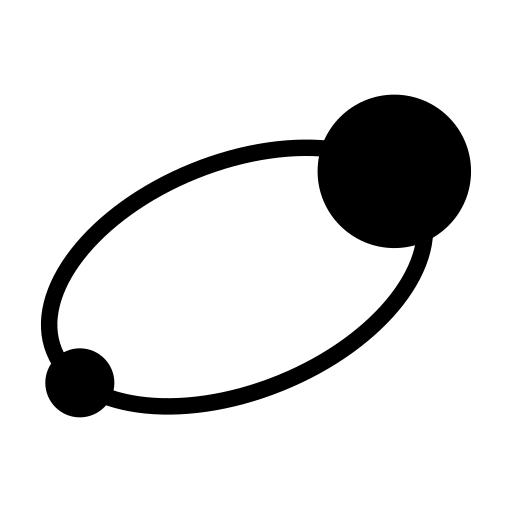
The studio and a venture form a binary system. In the logo, the large body is the studio and the small companion is the venture.
Gravitational radiation is how a binary system sends energy outward. For the studio, that energy is its ventures, which leave to exist on their own.
The signals are faint but precise. The studio works the same way: it stays quiet and lets the work speak.
Logos
Four lockups, each in black and white. Use the supplied files exactly as they are. Never redraw, recolour or regenerate the logo.
Horizontal logo — primary
The default. Use it wherever it fits.


Stacked logo
For square spaces.

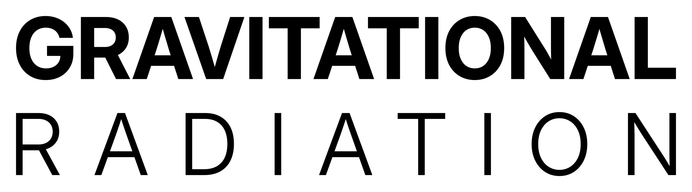
Wordmark
Where the symbol would be redundant, for example next to a symbol already on the page.


Symbol
Alone, for icons and favicons.


| Size | Black | White |
|---|---|---|
| Vector | favicon-black.svg | favicon-white.svg |
| 16, 32, 48 px | 16 · 32 · 48 | 16 · 32 · 48 |
| 180, 192, 512 px | 180 · 192 · 512 | 180 · 192 · 512 |
| Workspace | workspace-logo-320x132.png | |






Clear space
Keep a margin of X on all sides, where X is the cap height of “GRAVITATIONAL” in the wordmark. Nothing else enters that space.
Each supplied file already has a thin margin built in. Around the horizontal file, add about 5% of its width on every side to reach X. Around the stacked and wordmark files, add about 6.7%. The exact values are in tokens.css.
Minimum sizes
Colour and treatment
Black on light backgrounds. White on dark backgrounds. No other colours, gradients, outlines, shadows, stretching, rotating or re-typesetting.
Symbol geometry
For reference only. The files are the source; never rebuild the symbol from this description.
A closed ellipse with an aspect ratio of 0.58, rotated −22°. A large body sits on the upper right of the ellipse. A companion, 45% of its size, sits on the lower left.
Typeface
Inter, for everything: the wordmark, headlines, body text, interfaces and documents. It is self-hosted as one variable font, with no requests to outside servers.
- Line one
- “GRAVITATIONAL”, Inter at weight ~720
- Line two
- “RADIATION”, Inter at weight ~350, tracked out
- Optical size
- 32, on both lines
- Width
- Both lines justified to the same width
- Case
- Uppercase. The wordmark is the only place it appears.
Weights in the system
Aa Bb Cc Dd Ee Ff Gg Hh Ii Jj Kk Ll Mm Nn Oo Pp Qq Rr Ss Tt Uu Vv Ww Xx Yy Zz 0123456789 — ’ “ ” · &
Colours
Black and white. Three grays for secondary text and dividers, and for nothing else. No accent colours, ever.
- Black
#000000·--gr-black- Type and logo on light backgrounds; dark backgrounds
- White
#FFFFFF·--gr-white- Light backgrounds; type and logo on dark backgrounds
- Gray 100
#E6E6E6·--gr-gray-100- Dividers on light backgrounds
- Gray 400
#A3A3A3·--gr-gray-400- Secondary text on black, 8.3:1
- Gray 600
#666666·--gr-gray-600- Secondary text on white, 5.7:1. Dividers on black.
Gray 400 is never used for text on white, and Gray 600 is never used for text on black: neither pairing passes contrast.
Typography
Five steps. Sentence case throughout, including headings, buttons and navigation. Uppercase is reserved for the wordmark.
48–120px · 720 · 0.98 · −0.04em
Built, proven, released
28–48px · 600 · 1.1 · −0.025em
Each venture stands on its own
18px · 400 · 1.6 · −0.011em
The studio originates, builds and operates its own software ventures. When a venture proves itself, it spins out into its own company.
15px · 400 · 1.5 · −0.006em
Vectflow is a trade name of Gravitational Radiation LLC.
13px · 500 · 1.4 · +0.01em
Brand guidelines · Version 1.0
Display and headline sizes scale smoothly with the viewport between the two values shown. Keep body text to about 64 characters per line.
Sizes and spacing
One scale on a 4px base. Small steps set type and controls; large steps separate ideas. When unsure, use more space, not less.
--gr-space-14px--gr-space-28px--gr-space-312px--gr-space-416px--gr-space-524px--gr-space-632px--gr-space-748px--gr-space-864px--gr-space-996px--gr-space-10128px--gr-space-11192pxLayout grid
12 columns on wide screens, 8 on tablets, 4 on phones. The content is at most 1200px wide. Gutters are 24px, or 16px on phones. The outer margin runs from 16px on phones to 64px on wide screens. Sections are 96–192px apart.
The grid at this screen width.
Language
Calm, precise, plain, confident.
The studio speaks as itself, in the first-person plural or by name, never through a person. It describes what it does, not how impressive it is.
- Short sentences. One idea each.
- No hype words: revolutionary, cutting-edge, disrupt, synergy, world-class.
- No exclamation marks. No emoji.
- Specific over general. Say what the system does.
- Sentence case in every heading, button and label.
Vectflow answers inbound calls and texts, qualifies the job and books it.
Vectflow is a revolutionary, cutting-edge AI that will disrupt the trades!
We build our own ventures. We do not take clients.
We partner with world-class brands to unlock synergy.
When a venture proves itself, it becomes its own company.
Our ventures are on a rocket ship to the moon 🚀
Studio and ventures
STUDIO AND VENTURES
Style and motion
Style
- Strictly black and white.
- Large type is the main visual.
- Generous whitespace. Let one thing hold the page at a time.
Motion
Everything moves like the physics. Things orbit, converge and ripple. Nothing bounces, pops or wobbles.
Easings are slow and smooth, and never overshoot their end point. All motion respects the reduced-motion setting; when it is on, everything stands still.
Orbit
Continuous, linear revolution.--gr-duration-orbit · --gr-ease-orbit
Ripple
Waves spread outward and thin as they travel.--gr-duration-ripple · --gr-ease-ripple
Converge
Content arrives and settles without overshoot.--gr-duration-slow · --gr-ease-converge
Studio and ventures
Each venture has its own brand: its own name, logo, colours and voice. It is built to stand on its own.
Where the relationship needs stating, the venture uses the endorsement line, set in text:
A venture of Gravitational Radiation
- The endorsement line is set in the venture’s own typeface, at a size and weight below its logo.
- The line is always sentence case and is never rewritten.
- The studio logo never merges with a venture logo. They never share a lockup, a shape or a symbol.
- When both logos appear together, each keeps its own clear space.